Rating of cereals based on nutritional information
Can we predict the rating of cereals based on nutritional information?
analysis
python
Author
Aditya Ranade
Published
February 23, 2025
Cereals are commonly consumed for breakfast and there are plenty of options available for cereals. I found this dataset on Kaggle which gives the nutritional information about cereals as well as the ratings. It is not clear where the rating come from, but I think they are the average ratings from the customers. Can we predict the ratings based on the nutritional information of cereals ? First, we look at the exploratory data analysis and later try some simple regression models. First let us access and process the data through python.
# Load Libraries# Load Librariesimport pandas as pd # data processing, CSV file I/O (e.g. pd.read_csv)from plotnine import*import numpy as np # linear algebra# import statsmodels.api as smimport statsmodels.formula.api as smfimport matplotlib.pyplot as pltimport seaborn as snsimport randomfrom scipy.stats import pearsonr# Get data from github repopath ="https://raw.githubusercontent.com//adityaranade//portfolio//refs//heads//main//cereals//cereal.csv"df0=pd.read_csv(path, encoding='unicode_escape')df0.head()
name
mfr
type
calories
protein
fat
sodium
fiber
carbo
sugars
potass
vitamins
shelf
weight
cups
rating
0
100% Bran
N
C
70
4
1
130
10.0
5.0
6
280
25
3
1.0
0.33
68.402973
1
100% Natural Bran
Q
C
120
3
5
15
2.0
8.0
8
135
0
3
1.0
1.00
33.983679
2
All-Bran
K
C
70
4
1
260
9.0
7.0
5
320
25
3
1.0
0.33
59.425505
3
All-Bran with Extra Fiber
K
C
50
4
0
140
14.0
8.0
0
330
25
3
1.0
0.50
93.704912
4
Almond Delight
R
C
110
2
2
200
1.0
14.0
8
-1
25
3
1.0
0.75
34.384843
# modify the column namesdf0.columns = ['name', 'manufacturer','type','calories','protein','fat','sodium','fiber','carbohydrates','sugar','potassium','vitamins','shelf','weight','cups', 'rating']df0.head()
name
manufacturer
type
calories
protein
fat
sodium
fiber
carbohydrates
sugar
potassium
vitamins
shelf
weight
cups
rating
0
100% Bran
N
C
70
4
1
130
10.0
5.0
6
280
25
3
1.0
0.33
68.402973
1
100% Natural Bran
Q
C
120
3
5
15
2.0
8.0
8
135
0
3
1.0
1.00
33.983679
2
All-Bran
K
C
70
4
1
260
9.0
7.0
5
320
25
3
1.0
0.33
59.425505
3
All-Bran with Extra Fiber
K
C
50
4
0
140
14.0
8.0
0
330
25
3
1.0
0.50
93.704912
4
Almond Delight
R
C
110
2
2
200
1.0
14.0
8
-1
25
3
1.0
0.75
34.384843
# select data for the histogramdf = df0[["calories", "protein", "fat", "sodium", "fiber", "carbohydrates", "sugar","potassium","rating","name"]]df.head()
calories
protein
fat
sodium
fiber
carbohydrates
sugar
potassium
rating
name
0
70
4
1
130
10.0
5.0
6
280
68.402973
100% Bran
1
120
3
5
15
2.0
8.0
8
135
33.983679
100% Natural Bran
2
70
4
1
260
9.0
7.0
5
320
59.425505
All-Bran
3
50
4
0
140
14.0
8.0
0
330
93.704912
All-Bran with Extra Fiber
4
110
2
2
200
1.0
14.0
8
-1
34.384843
Almond Delight
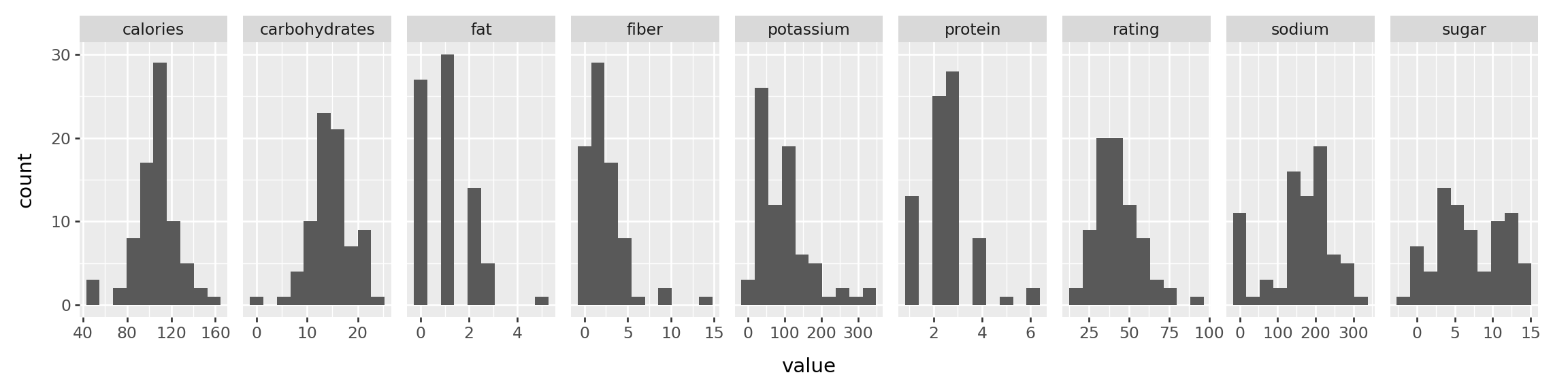
Now that we have the data ready, let us look at the histogram of each variables namely nutritional contents, specifically calories, protein, fat, sodium, fiber, carbo, sugars and potassium
# Use melt function for the histograms of variables df2 = pd.melt(df, id_vars=['name'])# df2.head()p = ( ggplot(df2, aes("value"))+ geom_histogram(bins=10)+ facet_grid(". ~ variable", scales='free_x')+ theme(figure_size=(12, 3)) )# If we want the density on y axis# p = (# ggplot(df2, aes("value", after_stat("density")))# + geom_histogram(bins=10)# + facet_grid(". ~ variable", scales='free_x')# + theme(figure_size=(12, 3))# )p.show()
The histogram of each of the variables do not show any problems as all the plots look decent. We will look at the correlation plot, which shows the correlation between each pair of variables in a visual form.
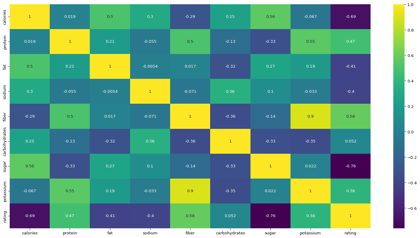
# Check the correlation between the variablesplt.figure(figsize=(20,10))sns.heatmap(df.iloc[:,:-1].corr(),annot=True,cmap="viridis")plt.show()
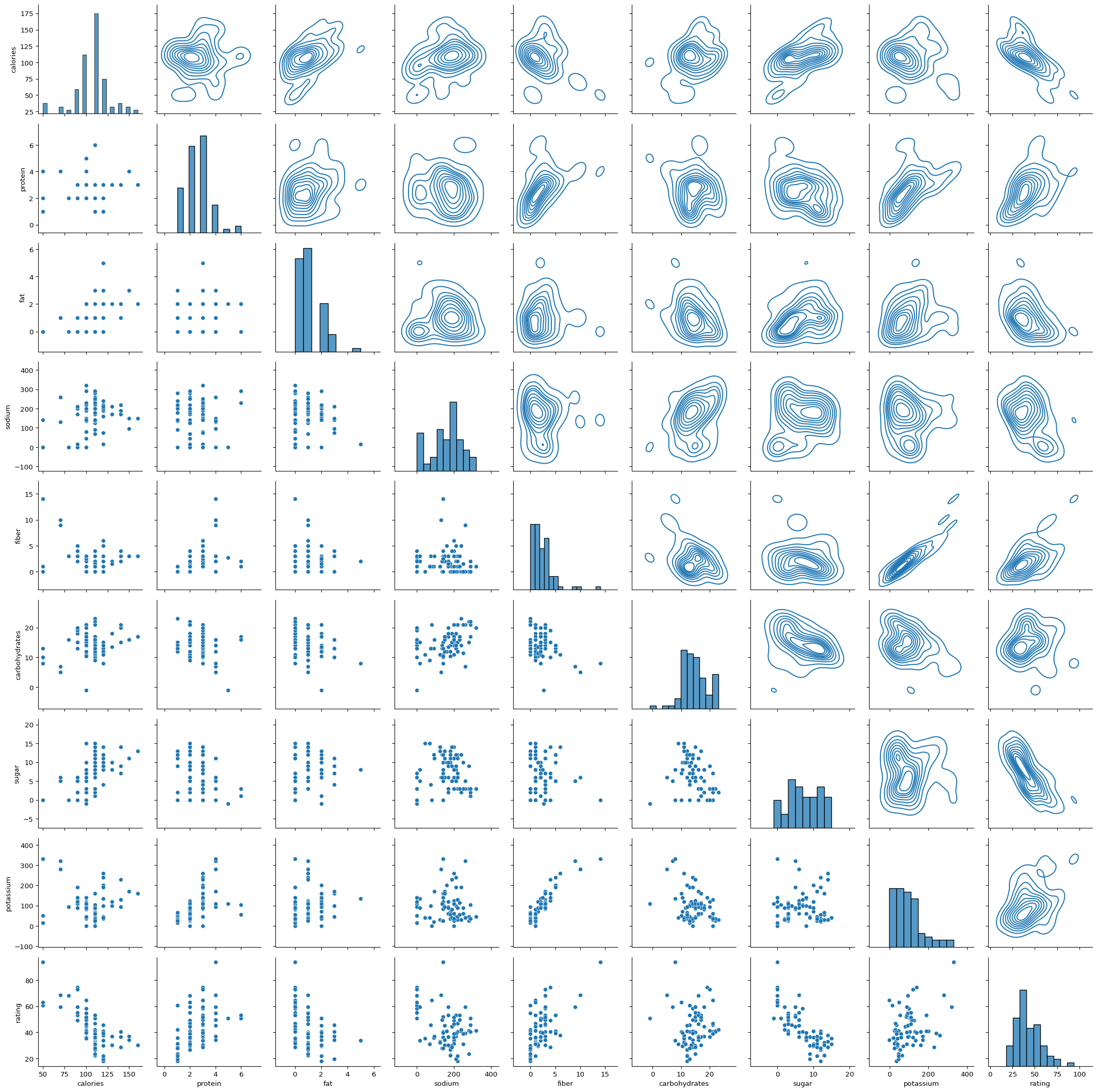
Rating variable has positive correlation with all the variables except sugar, sodium, fat and calories . This seems logical and will be useful when we build a regression model for the same. Next we take a look at the pairs plot which will give us idea about relationship between each pair of variables. Most important from the point of prediction is the last row where rating is the y axis and each of the variable is x axis.
The scatterplots of each variable with calories which can be seen in the upper triangular plots in the very first row. It seems there is a linear association between calories and fat, carbs and protein. However, it does not seem to have a linear association with fiber.
# Split data into train and test setindices =range(len(df)) # Create a list of indices# Get 75% random indicesrandom.seed(55) # for reproducible examplerandom_indices = random.sample(indices, round(0.75*len(df)))# Training datasetdata_train = df.iloc[random_indices,:-1]# Testing datasetdata_test = df.iloc[df.index.difference(random_indices),:-1]# Build a multiple linear regression model to predict calories using other variables using training dataresult = smf.ols("rating ~ calories + protein + fat + sodium + fiber + carbohydrates + sugar + potassium", data = data_train).fit()# check the summaryresult.summary()
OLS Regression Results
Dep. Variable:
rating
R-squared:
0.997
Model:
OLS
Adj. R-squared:
0.997
Method:
Least Squares
F-statistic:
2429.
Date:
Mon, 02 Jun 2025
Prob (F-statistic):
6.35e-61
Time:
18:41:04
Log-Likelihood:
-65.696
No. Observations:
58
AIC:
149.4
Df Residuals:
49
BIC:
167.9
Df Model:
8
Covariance Type:
nonrobust
coef
std err
t
P>|t|
[0.025
0.975]
Intercept
54.4433
0.868
62.753
0.000
52.700
56.187
calories
-0.2160
0.014
-15.385
0.000
-0.244
-0.188
protein
3.3032
0.152
21.680
0.000
2.997
3.609
fat
-1.8546
0.196
-9.451
0.000
-2.249
-1.460
sodium
-0.0573
0.001
-38.480
0.000
-0.060
-0.054
fiber
3.3924
0.140
24.228
0.000
3.111
3.674
carbohydrates
1.0424
0.048
21.634
0.000
0.946
1.139
sugar
-0.7696
0.054
-14.272
0.000
-0.878
-0.661
potassium
-0.0324
0.005
-6.648
0.000
-0.042
-0.023
Omnibus:
78.045
Durbin-Watson:
2.069
Prob(Omnibus):
0.000
Jarque-Bera (JB):
801.691
Skew:
-3.864
Prob(JB):
8.22e-175
Kurtosis:
19.492
Cond. No.
1.82e+03
Notes: [1] Standard Errors assume that the covariance matrix of the errors is correctly specified. [2] The condition number is large, 1.82e+03. This might indicate that there are strong multicollinearity or other numerical problems.
p-value for all the variables is low so all the variables are significantly affecting the response variable, rating. However the model output indicates there might be multicollinearity issue. Multicollinearity means the predictor variables are have high correlation among themselves. If we look at the correlation plot, fiber and potassium has 0.9 correlation which is high. One way to tackle multicollinearity is to consider principal component analysis (PCA). We will look at it in a while but let us first try to make predictions and look at the evaluation metrics.
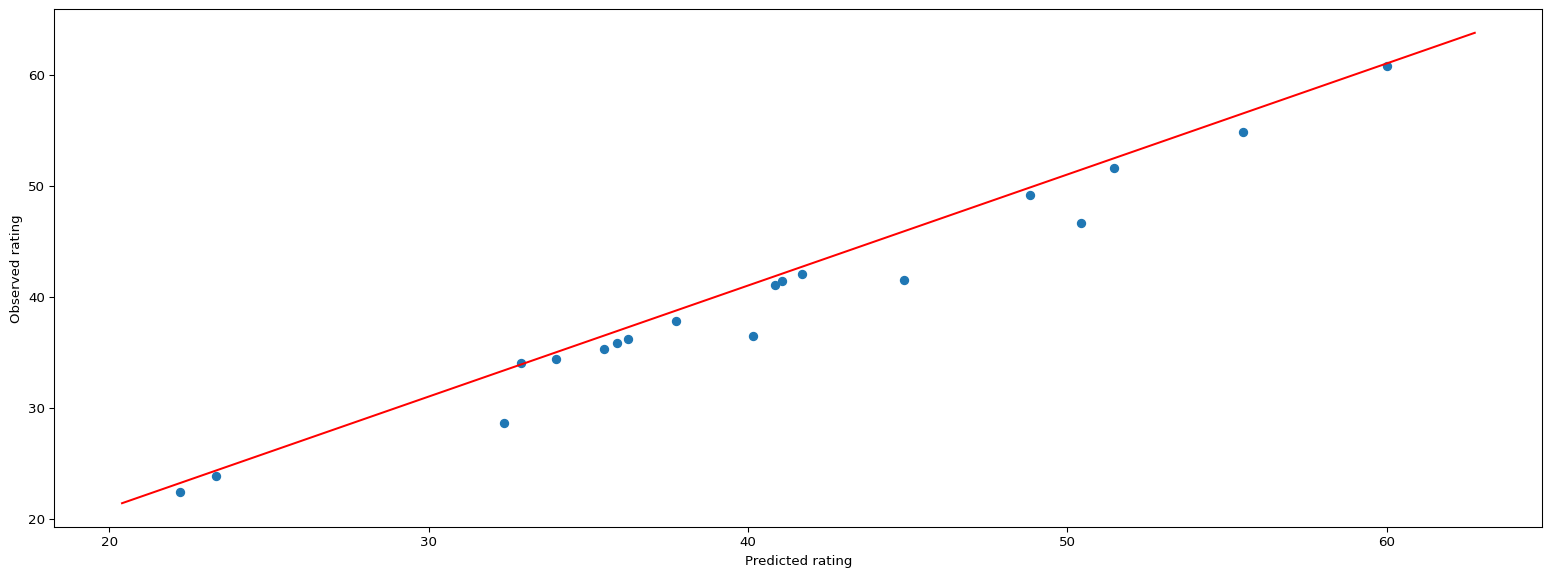
Now let us make prediction on the testing data and plot the observed vs. predicted plot
# Make predictions using testing datapredictions = result.predict(data_test)# Observed vs. Predicted plotplt.figure(figsize=(20,7))plt.scatter(predictions, data_test["rating"])plt.ylabel("Observed rating")plt.xlabel("Predicted rating")# Create the ablinex_line = np.linspace(min(data_test["rating"])-2, max(data_test["rating"])+2, 100)y_line =1* x_line +1plt.plot(x_line, y_line, color='red')plt.show()
The observed vs. predicted looks good. However there is low number of data points and hence we should take this with a grain of salt. Let us check some evaluation metrics like the Root Mean Squared Error (RMSE) and Mean Absolute Error (MAE).
from sklearn.metrics import mean_absolute_error,mean_squared_errorprint("Mean Absolute Error:",round(mean_absolute_error(data_test["rating"],predictions),2))print("Root Mean Squared Error:",round((mean_squared_error(data_test["rating"],predictions))**0.5,2))
Mean Absolute Error: 1.05
Root Mean Squared Error: 1.72
Root Mean Squared Error (RMSE) of 1.05 and Mean Absolute Error (MAE) of 1.72 is decent and indicates model is performing fairly well.
Now, we will run regression model based on principal component analysis since it helps with multicollinearity.
# Principal component analysisfrom sklearn.decomposition import PCA# separate the x and y variable for the training data firsty_train = data_train.iloc[:,-1:]X0_train = data_train.iloc[:,:-1]# Standardize the predictor data firstfrom sklearn.preprocessing import StandardScalersc = StandardScaler()# training dataX_train_scaled = sc.fit_transform(X0_train)# Now calculate the principal componentsfrom sklearn.decomposition import PCApca = PCA()principalComponents = pca.fit_transform(X_train_scaled)# Training dataX_train_pca = pd.DataFrame(data = principalComponents, columns=['PC{}'.format(i+1)for i inrange(principalComponents.shape[1])])explained_variance = pca.explained_variance_ratio_explained_variance
The first six principal components explain around 98% of the data, so we will use the first six principal components to build a regression model.
X_train_pca = pd.DataFrame(data = principalComponents, columns=['PC{}'.format(i+1)for i inrange(principalComponents.shape[1])])# combine the X and Y for the training datadata_train_pca = X_train_pcadata_train_pca.set_index(X0_train.index,inplace =True)data_train_pca['rating'] = y_traindata_train_pca.head()
PC1
PC2
PC3
PC4
PC5
PC6
PC7
PC8
rating
11
0.865400
0.737424
3.082256
-0.797678
-1.695220
-0.565655
-0.436512
-0.175165
50.764999
25
-1.656332
-0.688910
-0.969216
1.205505
0.111314
-0.454199
0.373535
-0.159738
31.435973
19
0.979620
2.049689
-0.266540
-0.475020
-0.352195
1.032443
-0.089196
-0.058422
40.448772
38
-0.939218
-0.515171
0.188656
-0.014788
0.070899
0.306183
0.027561
0.007296
36.523683
10
-2.157184
1.069870
-0.921099
0.649449
-0.525503
0.549343
0.091509
-0.057116
18.042851
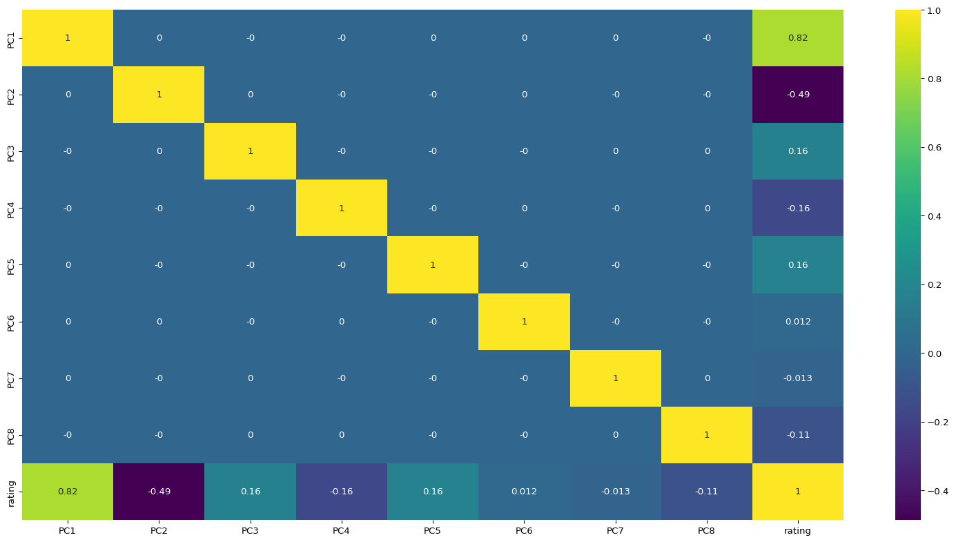
# Correlation plot for principal componentsplt.figure(figsize=(20,10))sns.heatmap(data_train_pca.corr().round(4),annot=True, cmap="viridis")plt.show()
We can observe that only rating variable has correlation with the principal components and the correlation between the principal components is 0. The correlation of rating with principal component 6 and 8 is considerably low and hence we will not use them in the model. So we will use the principal components 1,2,3,4,5 and 8 to build a regression model.
# Now run the OLS regression model on the first five principal components# Fit the OLS regressionresult_pca = smf.ols("rating ~ PC1 + PC2 + PC3 + PC4 + PC5 + PC8", data = data_train_pca).fit()# check the summaryresult_pca.summary()
OLS Regression Results
Dep. Variable:
rating
R-squared:
0.997
Model:
OLS
Adj. R-squared:
0.997
Method:
Least Squares
F-statistic:
3009.
Date:
Mon, 02 Jun 2025
Prob (F-statistic):
3.38e-63
Time:
18:41:06
Log-Likelihood:
-68.981
No. Observations:
58
AIC:
152.0
Df Residuals:
51
BIC:
166.4
Df Model:
6
Covariance Type:
nonrobust
coef
std err
t
P>|t|
[0.025
0.975]
Intercept
43.6488
0.111
392.171
0.000
43.425
43.872
PC1
7.2019
0.066
109.932
0.000
7.070
7.333
PC2
-5.1916
0.079
-65.488
0.000
-5.351
-5.032
PC3
2.1011
0.098
21.481
0.000
1.905
2.297
PC4
-2.6963
0.122
-22.160
0.000
-2.941
-2.452
PC5
3.3596
0.152
22.091
0.000
3.054
3.665
PC8
-7.8789
0.511
-15.429
0.000
-8.904
-6.854
Omnibus:
59.001
Durbin-Watson:
2.019
Prob(Omnibus):
0.000
Jarque-Bera (JB):
340.488
Skew:
-2.843
Prob(JB):
1.16e-74
Kurtosis:
13.419
Cond. No.
7.79
Notes: [1] Standard Errors assume that the covariance matrix of the errors is correctly specified.
\(R^{2}\) is 99.7% which is decent and all the predictor variables have a low p-value value. We make predictions using the test data and then plot the out of sample observed vs. predicted. First we calculate the principal components of the testing data and then make the predictions.
# X for testing dataX0_test = data_test.iloc[:,:-1]# scaled test dataX_test_scaled = sc.transform(X0_test)# calculate the principal components for the testing dataX_test = pca.transform(X_test_scaled)X_test_pca = pd.DataFrame(data = X_test, columns=['PC{}'.format(i+1)for i inrange(X_test.shape[1])])# calculate the predictionspredictions_pca = result_pca.predict(X_test_pca)
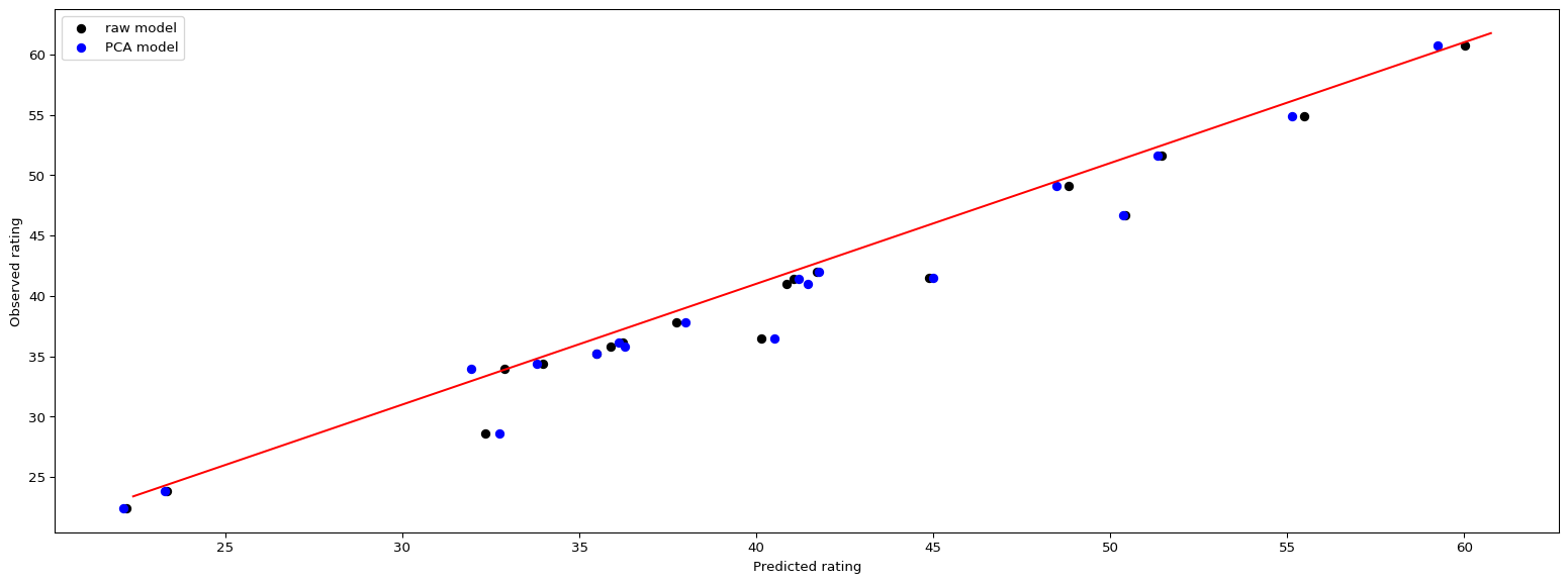
Now we plot the out of sample predictions obtained from regression model using raw data as well as the predictions obtained from model using the six principal components on the same plot with different colors.
The out of sample observed vs. predicted plot looks decent with all the points just around the red line. WE look at the evaluation metrics for the model built using the principal components.
from sklearn.metrics import mean_absolute_error,mean_squared_errorprint("Mean Absolute Error:",round(mean_absolute_error(data_test["rating"],predictions_pca),2))print("Root Mean Squared Error:",round((mean_squared_error(data_test["rating"],predictions_pca))**0.5,2))
Mean Absolute Error: 1.23
Root Mean Squared Error: 1.89
For the regression model using first six principal components, Root Mean Squared Error (RMSE) is 1.23 and Mean Absolute Error (MAE) is 1.89 which is slightly higher than the regression model using the raw data.