I found this dataset on UCI machine learning repository which gives gallstone disease identification data. First, we look at the exploratory data analysis and later try to build predictive models like logistic regression, support vector classifier and k nearest neighbour model. First let us access and process the data through python.
# Load Librariesimport pandas as pd # data processing, CSV file I/O (e.g. pd.read_csv)from plotnine import*import numpy as np # linear algebra# import statsmodels.api as smimport statsmodels.formula.api as smfimport matplotlib.pyplot as pltimport seaborn as snsimport randomimport openpyxl# Get gallstone data from github repopath ="https://raw.githubusercontent.com/adityaranade/portfolio/refs/heads/main/gallstone/gallstone_dataset.csv"df0=pd.read_csv(path)df0.head()
Gallstone Status
Age
Gender
Comorbidity
Coronary Artery Disease (CAD)
Hypothyroidism
Hyperlipidemia
Diabetes Mellitus (DM)
Height
Weight
...
High Density Lipoprotein (HDL)
Triglyceride
Aspartat Aminotransferaz (AST)
Alanin Aminotransferaz (ALT)
Alkaline Phosphatase (ALP)
Creatinine
Glomerular Filtration Rate (GFR)
C-Reactive Protein (CRP)
Hemoglobin (HGB)
Vitamin D
0
0
50
0
0
0
0
0
0
185
92.8
...
40.0
134.0
20.0
22.0
87.0
0.82
112.47
0.0
16.0
33.0
1
0
47
0
1
0
0
0
0
176
94.5
...
43.0
103.0
14.0
13.0
46.0
0.87
107.10
0.0
14.4
25.0
2
0
61
0
0
0
0
0
0
171
91.1
...
43.0
69.0
18.0
14.0
66.0
1.25
65.51
0.0
16.2
30.2
3
0
41
0
0
0
0
0
0
168
67.7
...
59.0
53.0
20.0
12.0
34.0
1.02
94.10
0.0
15.4
35.4
4
0
42
0
0
0
0
0
0
178
89.6
...
30.0
326.0
27.0
54.0
71.0
0.82
112.47
0.0
16.8
40.6
5 rows × 39 columns
# select specific columnsdf = df0[["Gallstone Status","Vitamin D","Total Body Water (TBW)","Lean Mass (LM) (%)","C-Reactive Protein (CRP)"]]# df.head()
# Use melt function for the histogramsdf2 = pd.melt(df, id_vars=['Gallstone Status'])# df2.head()
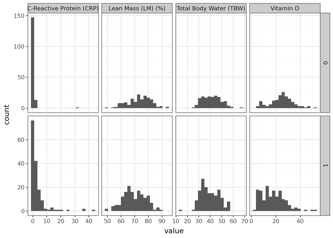
Now that we have the data ready, let us look at the histogram of each variables namely calories, fat, carbs, fiber, protein and sodium
p = (ggplot(df2, aes("value"))+ geom_histogram(bins=20)+ facet_grid("Gallstone Status ~ variable", scales="free")+ theme_bw())p.show()
The histogram of each of the variables do not show any problems as all the plots look decent. We will look at the correlation plot.
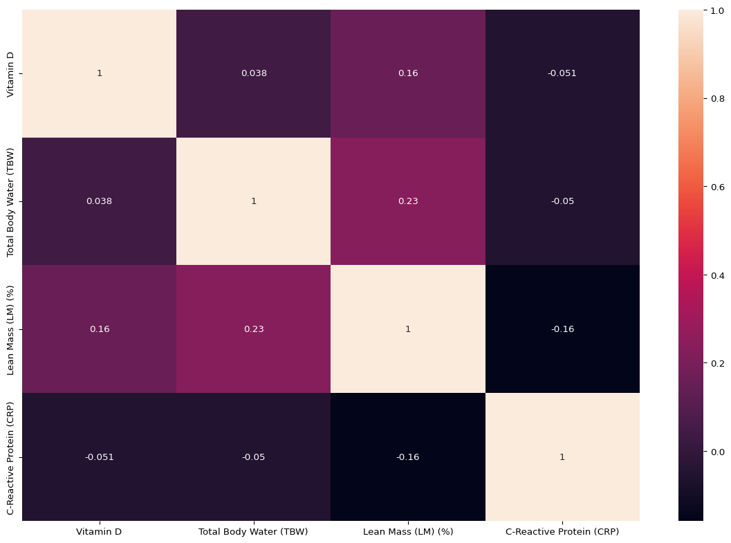
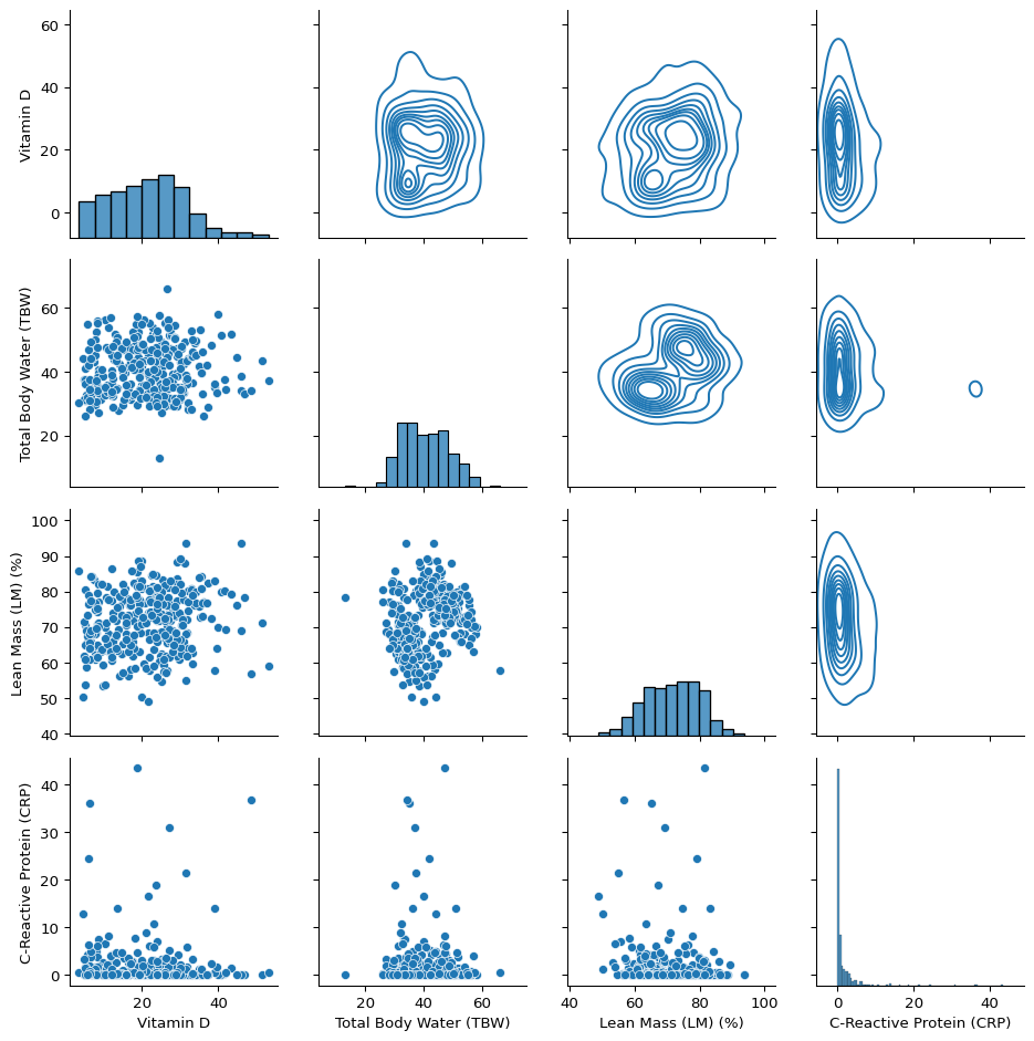
Correlation plot indicates weak association between all the variables which indicates there might not be severe multicolinearity. It does not warrant any cause of concern. Now we will look at the pairs plot which will show the pairwise relationship.
The scatterplots of each variable with which can be seen in the lower triangular plots. No strong association between any two variables. We will try to run different models like logistic regression, k nearest neighbours and support vector classification model on the data. First we will split the data into training (70%) and testing set (30%) and standardize the data.
from sklearn.model_selection import train_test_splitfrom sklearn.preprocessing import StandardScaler# Split data into training and testing setdf_train0, df_test0 = train_test_split(df, test_size=0.3, random_state=23)# Scale (exclude first column)scaler = StandardScaler()df_train = df_train0.copy()df_test = df_test0.copy()df_train.iloc[:, 1:] = scaler.fit_transform(df_train0.iloc[:, 1:])df_test.iloc[:, 1:] = scaler.transform(df_test0.iloc[:, 1:])X_train = df_train.iloc[:,1:]y_train = df_train.iloc[:,0]X_test = df_test.iloc[:,1:]y_test = df_test.iloc[:,0]
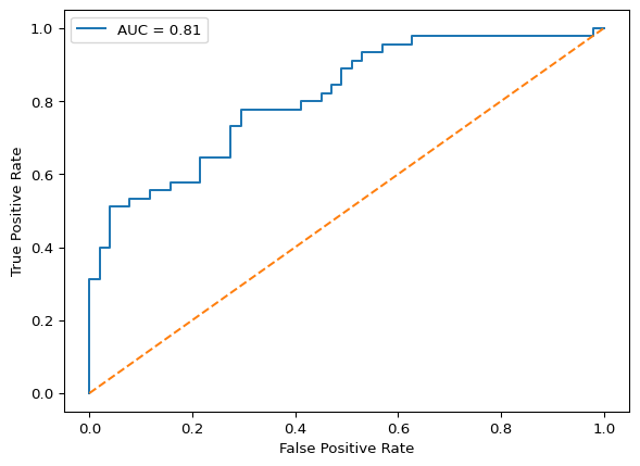
Now we will run a logistic regression model first.
The combined evaluation metrics can be seen in the table above. It seems the k nearest neighbor model has the highest accuracy. However, the accuracy for the logistic regression and support vector machine models is not too bad. The R code for the analysis can be found here