We all like starbucks food, but what about the nutritional value of them?
analysis
python
Author
Aditya Ranade
Published
May 1, 2025
Starbucks is one of the most valued coffee chain in the world. A lot of people like to consume the food available at starbucks. But how good are they in terms of the nutritional value?
I found this dataset on Kaggle which gives the nutritional information about their food products. In my precious post, I built a multiple linear regression model to predict the calories in beverage based on the nutritional contents of the beverage. Now we will try to do the same for the food products.
First, we look at the exploratory data analysis and later try some simple regression models. First let us access and process the data through python
# Load Librariesimport pandas as pd # data processing, CSV file I/O (e.g. pd.read_csv)from plotnine import*# for plotsimport numpy as np # linear algebraimport matplotlib.pyplot as pltimport seaborn as snsimport statsmodels.formula.api as smfimport randomfrom scipy.stats import pearsonr# Get starbucks data from github repodf0=pd.read_csv("https://raw.githubusercontent.com//adityaranade//starbucks//refs//heads//main//data//starbucks-menu-nutrition-food.csv", encoding='unicode_escape')df0.head()
Unnamed: 0
Calories
Fat (g)
Carb. (g)
Fiber (g)
Protein (g)
0
Chonga Bagel
300
5.0
50
3
12
1
8-Grain Roll
380
6.0
70
7
10
2
Almond Croissant
410
22.0
45
3
10
3
Apple Fritter
460
23.0
56
2
7
4
Banana Nut Bread
420
22.0
52
2
6
#modify the column namesdf0.columns = ['name', 'calories','fat','carbs','fiber','protein']df0.head()#convert data type to float for all the columns except namefor i in df0.columns[1:]: df0[i]=df0[i].astype("float")# df0.info()
df = df0# Use melt function for the histogramsdf2 = pd.melt(df, id_vars=['name'])# df2.head()
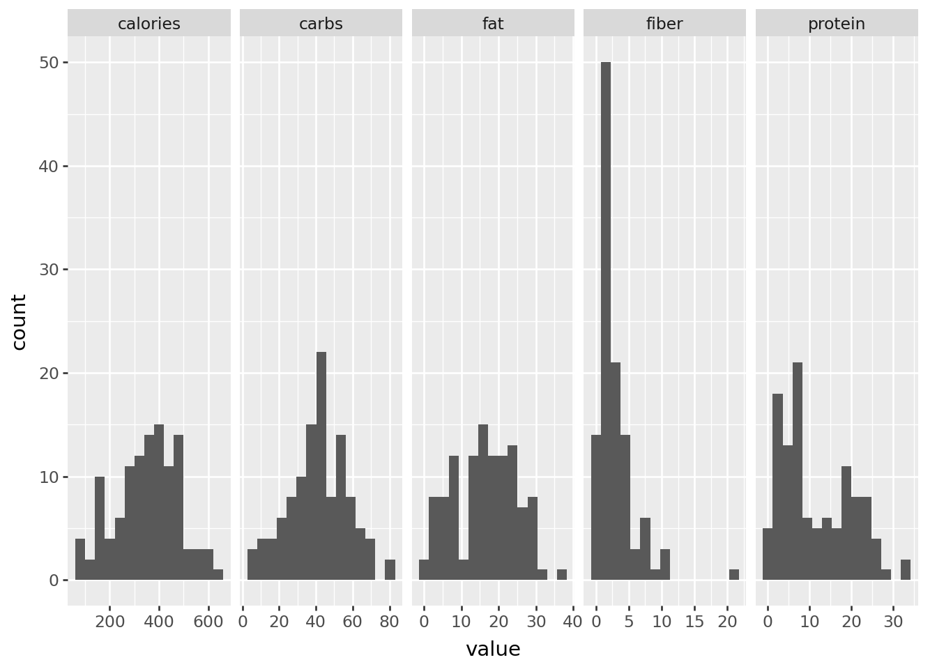
Now that we have the data ready, let us look at the histogram of each variables namely calories, fat, carbs, fiber, protein and sodium
The histogram of each of the variables do not show any problems as all the plots look decent. We will look at the correlation plot.
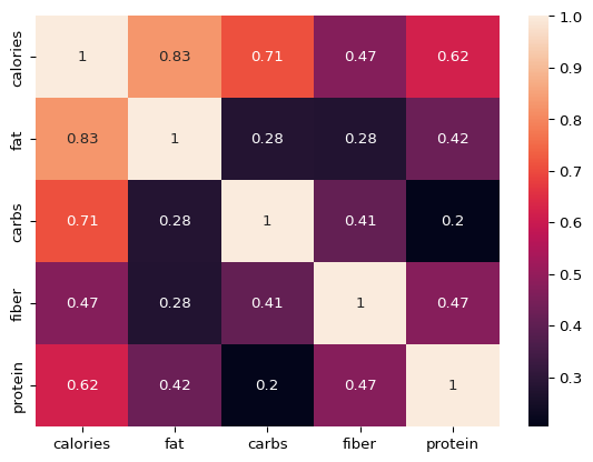
# Check the correlation between the variables# plt.figure(figsize=(20,7))sns.heatmap(df.iloc[:,1:].corr(),annot=True)plt.show()
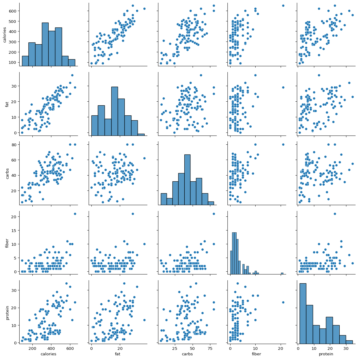
Correlation plot indicates positive association between all the variables which is desired. Now we will look at the pairs plot which will show the pairwise histogram.
The scatterplots of each variable with calories which can be seen in the upper triangular plots in the very first row. It seems there is a linear association between calories and fat, carbs and protein. However, it does not seem to have a linear association with fiber.
# Split data into train and test setindices =range(len(df)) # Create a list of indices# Get 75% random indices for training datarandom.seed(23) # for repreducible examplerandom_indices = random.sample(indices, round(0.75*len(df)))# Training datasetdata_train = df.iloc[random_indices,]# Testing datasetdata_test = df.iloc[df.index.difference(random_indices),]# Build a multiple linear regression model to predict calories using other variables using training dataresult = smf.ols("calories ~ fat + carbs + fiber + protein", data = data_train).fit()# check the summaryresult.summary()
OLS Regression Results
Dep. Variable:
calories
R-squared:
0.995
Model:
OLS
Adj. R-squared:
0.995
Method:
Least Squares
F-statistic:
4351.
Date:
Sun, 11 May 2025
Prob (F-statistic):
1.06e-92
Time:
08:26:44
Log-Likelihood:
-304.54
No. Observations:
85
AIC:
619.1
Df Residuals:
80
BIC:
631.3
Df Model:
4
Covariance Type:
nonrobust
coef
std err
t
P>|t|
[0.025
0.975]
Intercept
-2.8394
3.006
-0.945
0.348
-8.821
3.142
fat
8.8760
0.129
68.933
0.000
8.620
9.132
carbs
4.0291
0.066
61.478
0.000
3.899
4.160
fiber
-1.1151
0.402
-2.772
0.007
-1.916
-0.315
protein
4.3474
0.156
27.915
0.000
4.037
4.657
Omnibus:
8.990
Durbin-Watson:
2.042
Prob(Omnibus):
0.011
Jarque-Bera (JB):
12.887
Skew:
0.426
Prob(JB):
0.00159
Kurtosis:
4.707
Cond. No.
151.
Notes: [1] Standard Errors assume that the covariance matrix of the errors is correctly specified.
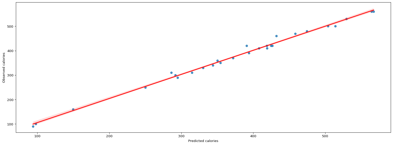
Now let us make prediction on the testing data and plot the observed vs. predicted plot
# Make predictions using testing datapredictions = result.predict(data_test)# Observed vs. Predicted plotplt.figure(figsize=(20,7))sns.regplot(y = data_test["calories"],x = predictions,line_kws={"color":"red"})plt.ylabel("Observed calories")plt.xlabel("Predicted calories")plt.show()# decent plot
The observed vs. predicted looks good. However there is low number of data points and hence we should take this with a grain of salt. Let us check some evaluation metrics like the Root Mean Squared Error (RMSE) and Mean Absolute Error (MAE).
from sklearn.metrics import mean_absolute_error,mean_squared_error,r2_scoreprint("Mean Absolute Error:",round(mean_absolute_error(data_test["calories"],predictions),2))print("Root Mean Squared Error:",round((mean_squared_error(data_test["calories"],predictions))**0.5,2))
Mean Absolute Error: 7.54
Root Mean Squared Error: 10.7
Root Mean Squared Error (RMSE) of 7.54 and Mean Absolute Error (MAE) of 10.7 is decent and indicates model is performing fairly well.